
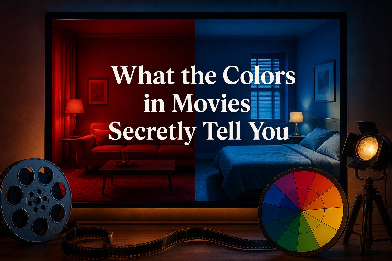
Short answer: color psychology in film is the deliberate use of color to guide emotion and meaning before dialogue explains anything. Warm reds and oranges can make a moment feel urgent or intimate, while cool blues and greens can suggest distance, calm, unease, or isolation; the story around them decides the precise reading.
What the colors in movies secretly tell you is rarely a single hidden message. A movie color palette works more like a visual language: it steers your attention, sets expectations, and lets a director put emotional pressure on a scene without asking a character to say what they feel.
That is why I like to watch a scene once for plot and a second time with the sound low. In the second pass, costume, walls, light, and even a single object often show an emotional pattern that felt intuitive the first time.
This guide explains how colors in movies work, what common hues tend to imply, and how filmmakers build those implications into a character arc. It also separates useful color theory from the tempting but mistaken idea that every color has one universal translation.
Table of Contents
Colors in movies work as a visual language
Colors in movies communicate through contrast, repetition, and change. A saturated red coat placed in a gray world gets attention because it is visually unusual there; if that coat returns at key moments, viewers begin to connect it with the person, danger, desire, or memory attached to it.
Color psychology is not mind reading. It is a set of learned associations, bodily reactions, cultural habits, and visual choices that a film can arrange into a clear emotional cue.
Color psychology in film, defined: filmmakers select and control colors to create an emotional response, establish a world, direct focus, or suggest a story idea before the audience hears dialogue.
Warm colors usually bring a scene closer
Red, orange, and yellow are warm colors. They often feel active, physical, social, or immediate because they appear to advance toward the viewer, especially when they sit against a cooler background.
A warm palette can mean romance, celebration, heat, appetite, anger, or alarm. The emotional result depends on saturation, brightness, acting, music, and what the warm color interrupts.
Cool colors usually create distance or restraint
Blue, green, and blue-violet are cool colors. They can make an image feel spacious, quiet, clinical, nocturnal, natural, or emotionally removed.
Cool does not automatically mean sad. A clear blue day can read as free and hopeful, while a sickly green office can feel threatening; visual storytelling comes from the relationship among choices, not a color swatch in isolation.
Hue, saturation, and brightness change the message
Hue is the color family, such as red or blue. Saturation is its intensity, while brightness describes how light or dark it appears.
A deep, muted red can suggest old grief or restrained power, whereas a bright saturated red can feel playful, dangerous, or artificial. Color grading can shift these qualities after shooting, but production design, wardrobe, makeup, locations, and lighting supply much of the image before post-production begins.
Colors in movies suggest tendencies rather than fixed codes
The most useful way to read color symbolism is to ask what a color is doing in this particular film. Does it belong to one character, invade a neutral frame, disappear as someone changes, or clash with the emotion on screen?
Red signals intensity, attention, and risk
Red has visual force. Films often connect it to love, appetite, violence, authority, shame, warning, or a decision that cannot be ignored.
In Schindler’s List, the red coat is conspicuous within an otherwise largely monochrome image, making one child impossible to overlook. The point is not that red always means danger; it is that contrast gives the color moral and emotional weight in that scene.
Blue signals calm, loneliness, control, or longing
Blue can lower the apparent temperature of an image and make people look apart from one another. It often supports stories about grief, technology, order, night, memory, trust, or emotional reserve.
Very pale blue may feel open and clean, while steel blue can read as severe or institutional. When a film puts blue around a character during a personal loss, the color does not cause sadness; it gives the sadness a visible atmosphere.
Green signals life, envy, money, or something off-balance
Green has unusually wide range because it can be fresh, natural, poisonous, wealthy, or artificial. Healthy foliage and soft daylight can make green feel restorative, but fluorescent green can make skin and rooms seem uneasy.
The Matrix is a familiar example of a green-leaning visual world associated with computer code and an artificial system. The tint supports the film’s idea of a reality filtered through machinery, rather than serving as a general rule that green equals evil.
Yellow signals optimism, exposure, warning, or instability
Yellow attracts the eye because it appears bright and energetic. It can suggest sunlight, youth, curiosity, humor, decay, caution tape, obsession, or the uncomfortable glare of a place with nowhere to hide.
Desaturated yellow often feels dusty or exhausted, while a sharp lemon yellow can feel playful or aggressive. Pair it with black and the warning association becomes especially strong; pair it with soft blue and it may feel gentle instead.
Orange signals warmth, appetite, and excess
Orange sits between red’s force and yellow’s brightness. It can carry firelight, autumn, domestic warmth, hunger, physicality, nightlife, or a feverish sense that a scene has become too much.
Because orange often appears in practical sources such as lamps, candles, fire, and sodium streetlights, it can make a frame feel inhabited. Against teal or blue, it also creates a high-contrast complementary pairing that quickly separates faces from the background.
Purple signals mystery, luxury, and divided identity
Purple mixes red’s energy with blue’s restraint. Movies may use it for wealth, ceremony, fantasy, spiritual questions, corruption, sensuality, or a character caught between opposing impulses.
A small purple detail can feel more deliberate than a room full of it because it is less common in everyday environments. That rarity makes it useful for a prop, costume accent, or location that needs to feel slightly outside ordinary life.
Black signals absence, authority, or the unknown
Black can hide detail, create negative space, and make a figure appear controlled or threatening. It may also suggest mourning, elegance, anonymity, protection, rebellion, or the simple fact that the audience lacks information.
Black gains meaning through texture and light. A glossy black suit under bright light carries a different feeling from a character nearly lost in a low-key shadow.
White signals openness, innocence, sterility, or emptiness
White can make a setting seem pure, peaceful, futuristic, clinical, or emotionally blank. When a film fills a frame with white, it removes visual clutter and can make the smallest colored object feel loaded with importance.
White is also a useful reversal tool. A bright hospital room, for example, can look safe or frightening depending on the behavior inside it and the coldness of the lighting.
Watch for contrast, not labels: a color gets stronger when it is rare, placed beside its opposite, or repeated at a story turning point. The question is less “What does red mean?” and more “Why is this red here, now, next to that?”
Color tells story before dialogue explains it
Color as a storytelling device can track a character development arc. A character may begin in neutral or cool clothing, then gradually acquire warmer accents as they reconnect with other people, or move in the opposite direction as their world narrows.
That progression works best when the audience feels it before naming it. Repetition gives a color a pattern, and a break in that pattern tells viewers that something has changed.
Color can foreshadow a turn in the plot
Filmmakers can introduce a hue before its full narrative meaning is clear. If red begins as a small detail and later takes over a scene just before a character makes a destructive choice, the audience experiences continuity even if no one points it out.
Foreshadowing does not require a literal code. A repeated color may simply prepare the emotional weather of a later event.
Color can define competing worlds
In The Wizard of Oz, the shift from the muted Kansas material to the richly colored world of Oz makes a change in reality immediately legible. The color contrast does narrative work at the instant it appears: this is not the same place, and ordinary rules may not apply.
World-building can work on a smaller scale too. A home, workplace, school, or underground club may each receive a distinct palette so viewers know where they are before a wide establishing shot arrives.
Color can place a viewer beside or apart from a character
When a character’s clothing closely matches the room, they can appear absorbed by their environment. A contrasting costume makes them look isolated, resistant, exposed, or newly important.
Breaking Bad is often discussed for its purposeful costume color choices. The series gives viewers a practical lesson: costume design can reinforce character roles and shifts without turning wardrobe into a distracting symbol hunt.
Color can control attention inside a busy frame
Directors and cinematographers often reserve the strongest saturation for the one detail the audience needs to notice. A colored door at the far end of a gray corridor can pull the eye before the camera moves toward it.
This is one reason color can feel secret. You may believe you noticed a prop because the plot made it important, when color made you look at it first.
A palette gives a film its color grammar
A palette is a limited, intentional set of colors that makes locations, costumes, and lighting feel related. Limitation does not mean every shot looks identical; it means the movie has a visual logic that can bend at meaningful moments.
Complementary palettes create visible tension
Complementary colors sit opposite each other on a color wheel, such as blue and orange. Their contrast separates subjects from backgrounds and can make an image feel energetic, divided, or heightened.
Use this pairing with restraint. If every object competes at maximum intensity, the viewer has no clear place to look.
Analogous palettes create a unified mood
Analogous colors sit beside each other, such as blue, blue-green, and green. They tend to make a world feel cohesive, natural, dreamy, or enclosed because the colors share a family resemblance.
A film can introduce one contrasting accent when it wants a visual interruption. That single change often has more power than an entire frame of competing colors.
Triadic and monochromatic palettes create distinct kinds of order
A triadic palette uses three colors spaced around the wheel, creating lively balance when one color leads and the others support it. A monochromatic palette uses variations of one hue, relying on saturation and brightness to keep the image from flattening.
Neither is better by default. The story’s desired emotional response to color should choose the system, not a trend in color grading.
The three-color rule keeps a scene readable
The three-color rule in film is a practical guideline, not a law: choose a dominant color family, a supporting family, and an accent color. The dominant color establishes mood, the supporting color adds shape and depth, and the accent directs attention.
This approach helps a production team make choices that agree across set dressing, wardrobe, props, and lighting. It also gives the colorist a starting point rather than a pile of unrelated visual decisions.
The 60/30/10 rule gives a palette proportion
The 60/30/10 rule in filmmaking assigns roughly 60 percent of an image to the dominant color, 30 percent to a secondary color, and 10 percent to an accent. It is borrowed from design practice and works as a planning aid, not a measurement viewers need to calculate shot by shot.
In a scene, the dominant color may live in walls and overall light, the secondary one in furniture and wardrobe, and the accent in a prop or costume detail. The small accent becomes memorable because the surrounding image leaves it room to speak.
Genre, culture, and the screen change the reading
Genre gives audiences expectations before a scene begins. Horror often pushes greens, cyan, deep red, or near-black toward dread; romance may favor skin-friendly warmth and soft contrast; science fiction may use cool precision or bold artificial color to separate a future world from daily life.
Comedy can use bright, clear palettes to keep a world open and energetic, while crime stories often reduce saturation to make moral certainty feel scarce. These are conventions, not rules, and a film can create surprise by reversing them.
Cultural context changes color symbolism
Western viewers may associate red with danger, prohibition, love, or anger, while red can carry luck and celebration in many Chinese contexts. White may suggest weddings or innocence in some settings and mourning in others.
That does not make visual analysis impossible. It means a careful reading considers the film’s place, characters, audience, and cultural references rather than assuming one meaning travels unchanged everywhere.
Viewing conditions change the color you receive
Color is physical light reaching a screen, so display conditions matter. A dark theater, a bright phone outdoors, a television in vivid mode, and a compressed stream can make black levels, shadow detail, saturation, and contrast feel different.
When I revisit a film on a different screen, I treat a color reading as an interpretation, not a laboratory result. A palette’s intended relationship can still be visible, but subtle details may be harder to see outside a controlled presentation.
Color can feel bodily before it becomes analytical
Bright, saturated contrast can feel stimulating, while dim cool scenes can feel quieter or more distant. Those responses vary by person and situation, but filmmakers work with this general sensitivity when they change the color temperature or intensity at an emotional peak.
The point is not to claim that a hue forces one emotion. It is to recognize that color gives the brain one more stream of information alongside faces, sound, movement, and story.
Filmmakers can plan color from the script onward
A strong color plan starts with story questions rather than a favorite filter. Ask what the central character wants, what threatens that desire, and how the world should feel before and after the turning point.
Step 1: Name the emotional movement
Write one short sentence for the beginning, middle, and end of the character arc. For example, “guarded and controlled” might move toward “exposed and connected,” which gives production design a useful emotional direction without dictating every color.
Step 2: Build a mood board with references
Collect stills, paintings, fabric, architecture, landscapes, and photographs that share the desired feeling. Group them by scene or location, then circle recurring hues, levels of saturation, and brightness patterns.
A mood board should show relationships rather than merely attractive images. If every reference is beautiful but each belongs to a different palette, the board has not yet made a usable decision.
Step 3: Make a color script for the whole story
Lay out the major sequences in order and assign each one a dominant feeling and palette direction. Animation teams often use color scripts this way, but live-action filmmakers can make a simple version with colored blocks and notes.
Mark scenes where the palette intentionally breaks. A sudden loss of warmth, a new accent color, or the disappearance of a recurring hue can make a story turn visible.
Step 4: Coordinate the departments that put color in frame
Talk through the palette with the cinematographer, production designer, costume designer, hair and makeup team, and colorist. A blue jacket means little if the location, practical lights, and grade accidentally bury it in blue.
Plan for separation: decide when a character should blend into the world and when they should stand apart. Test wardrobe against the actual set materials and lighting rather than judging it under a store light.
Step 5: Grade for continuity, not rescue
Color grading can balance shots, shape contrast, and refine a palette, but it cannot replace a story decision that was never made. Keep reference frames nearby so the grade preserves the emotional logic established in pre-production.
A viewer exercise: choose one scene, pause on three frames, and list the dominant color, secondary color, and accent. Then ask what changes if you imagine the accent removed; that difference is often the color’s narrative job.
FAQs
What do colors symbolize in movies?
Colors in movies commonly signal mood, character, setting, or story change before dialogue explains them. Red may draw attention or suggest intensity, blue may create calm or distance, and green may suggest life or unease, but the surrounding story and cultural context determine the meaning.
What is the 3 color rule in film?
The three-color rule is a composition guideline that uses a dominant color, a supporting color, and a smaller accent color. It helps a scene remain coherent while giving the audience a clear visual focal point.
What is the 60/30/10 rule in filmmaking?
The 60/30/10 rule gives roughly 60 percent of a scene to a dominant color, 30 percent to a secondary color, and 10 percent to an accent. It is a flexible design guide for balancing sets, wardrobe, lighting, and props.
What colors evoke nervousness in film?
Highly saturated red, sickly green, harsh yellow, and intense contrast can contribute to nervousness, especially in unstable lighting or confined spaces. Nervousness comes from the full scene, so sound, performance, pacing, and context matter alongside color.
Is color symbolism in film subjective?
Color symbolism has shared patterns but is never completely fixed. Genre, culture, a viewer’s experience, and a film’s repeated visual choices can all change how a color is read.
Colors in movies reward a more attentive second look
Colors in movies do not secretly hand viewers a universal dictionary. They create a visual system that can establish mood, separate worlds, shape character development, foreshadow change, and point the eye toward what matters.
On your next watch, pick one recurring hue and follow it from the first scene to the last. In 2026, that simple habit remains one of the quickest ways to see how color theory turns images into visual storytelling.